Instant Insights: Feature Guide
Features
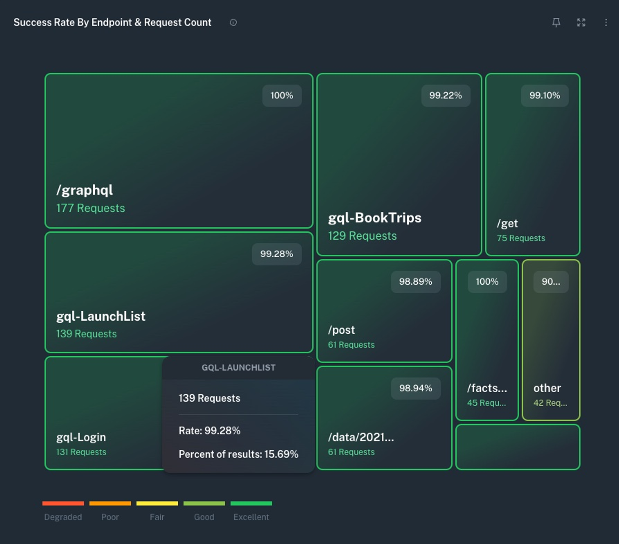
- Chart types: We provide four different chart types: count/sums, histograms, rates, and treemap.
- Pinning: Pin your favorite charts for easy access on the first tab by clicking the pin icon on a chart.
- Real-time Updates: Charts update in real-time as new data comes in.
- Lookback: Change the time range of your charts to see data from a previous period with the date/time selector at the top of the page.
- View Backing Workflow: Click the 3 dot menu on a chart to see the workflow that's providing the data for that chart or stop the workflow from running if you don't need it. Stopped workflows will remove the corresponding chart from the dashboard.
- Filtering: View dashboards for specific app IDs and OSes with the app selector at the top of the page.
- View Options: Expand a single chart or shrink the charts so that you can see more at a glance.
Filter / Compare
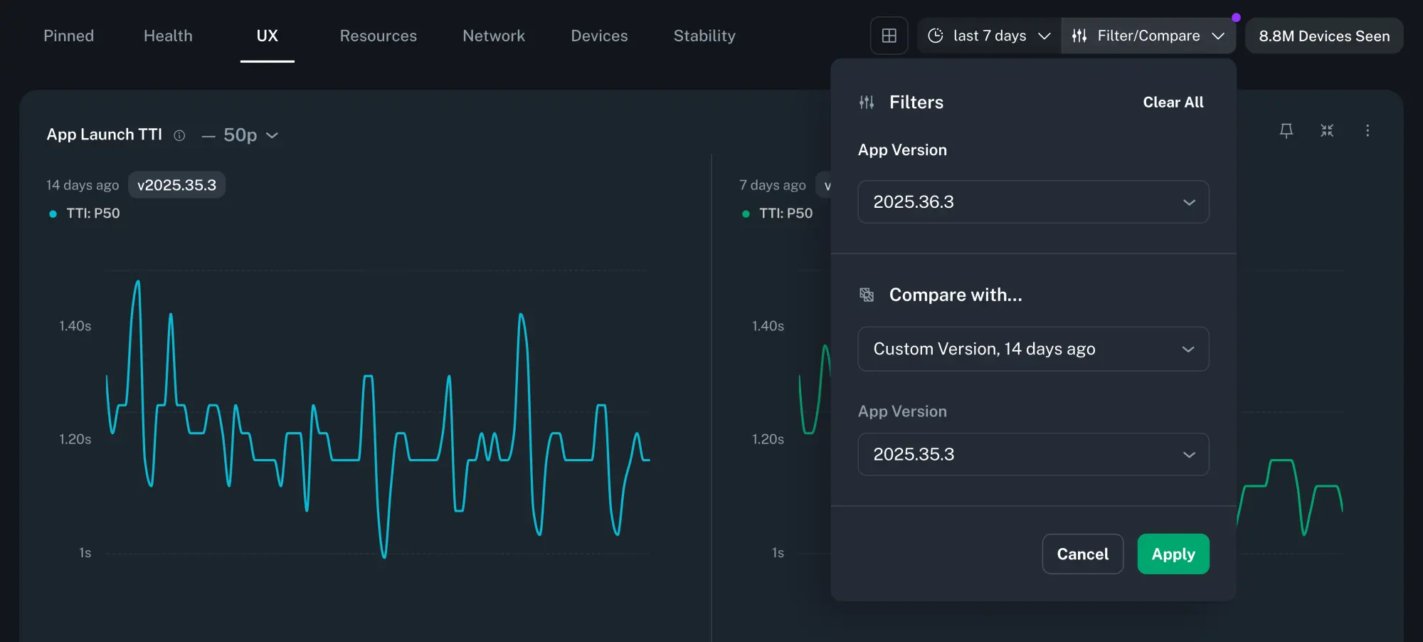
To help you closely monitor app releases, every chart in the dashboard supports filtering and comparing across app versions and time periods.
Filter
App Version
Filtering by App Version lets you focus on a specific release, typically the current one.
Compare
App Version
Comparing App Versions makes it easier to spot regressions between two releases.
Time Window
Time-shifted comparisons allow you to contextualize releases across equivalent time windows. For example, if you release new app versions weekly, you can compare the current release over the last 7 days to the previous release during the 7 days before that (i.e. 14 days ago).
Info
Selected filters and comparisons will persist as you navigate across different Insights pages within an app. However, if you switch apps or close the Instant Insights tab, your filter settings will be lost.
Categories
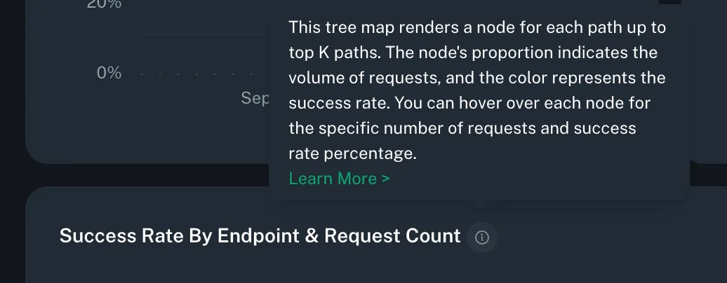
Want to know more about a specific chart? Each chart has a tooltip that explains what the chart is showing and how it's calculated.
Health
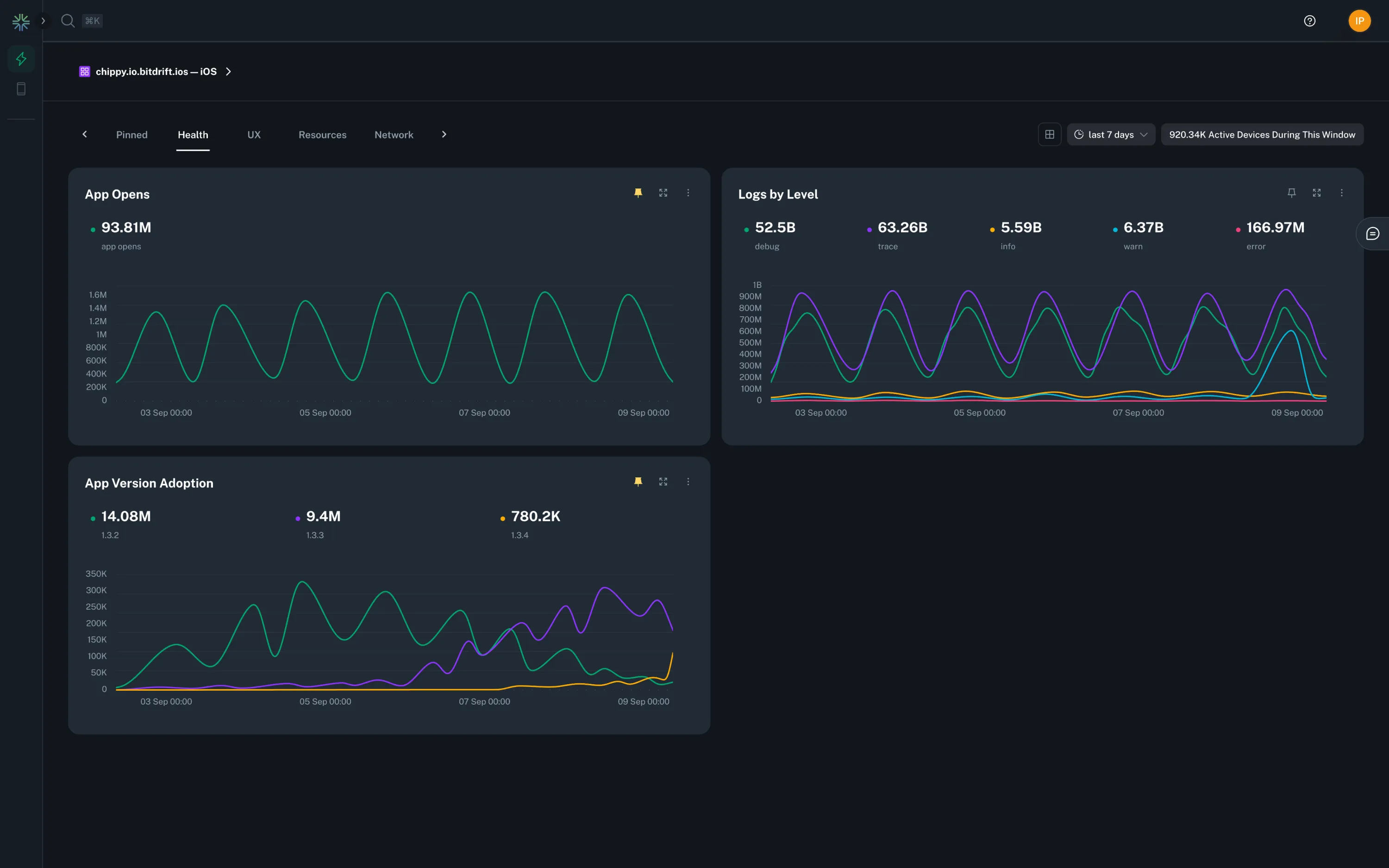
The Health category provides an overview of your app's health and performance. It includes charts that show app opens, logs by level, and app version adoption.
UX
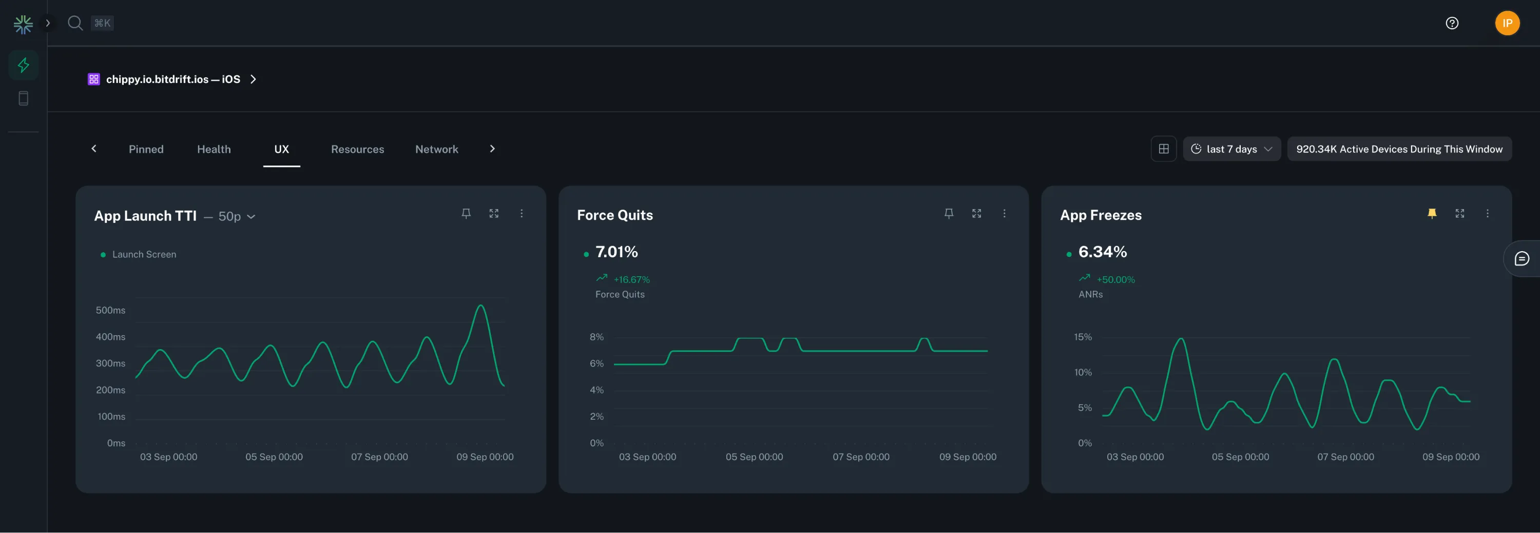
The UX category provides an overview of your app's user experience. It includes charts that show app launch TTI, force quits, and app freezes.
Info
See the SDK > TTI section for information on how to instrument your app's Time-To-Interactive.
User Journey
A valuable way to represent user journeys is via sankey charts. By default, we provide a chart that depicts the most common paths a user took before being forced to quit the app.
Info
See the SDK > Screen Views section for information on how to instrument your app's navigation information.
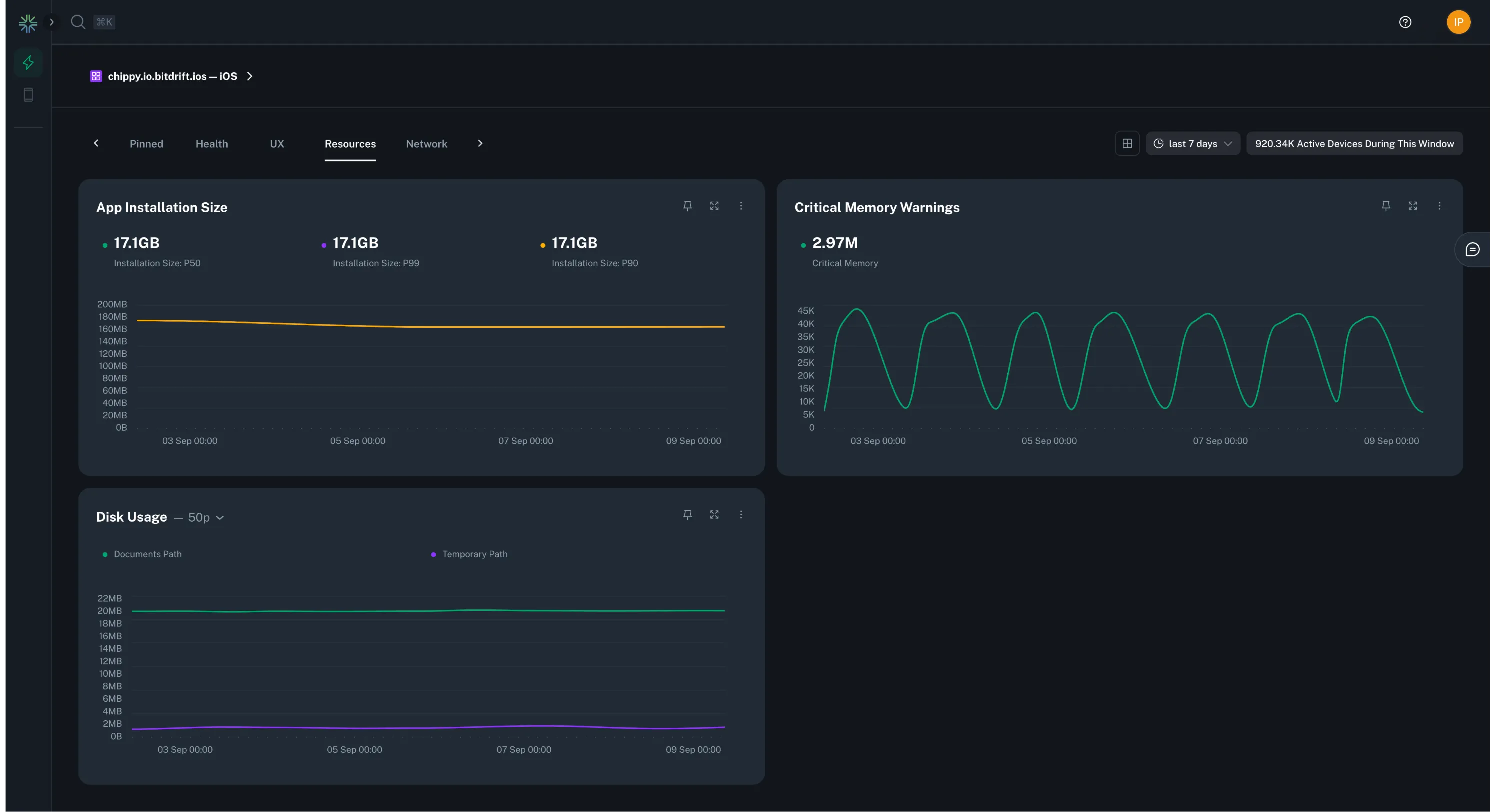
Resources
The Resources category provides an overview of your app's resource usage. It includes charts that show app installation size, critical memory warnings, and disk usage.
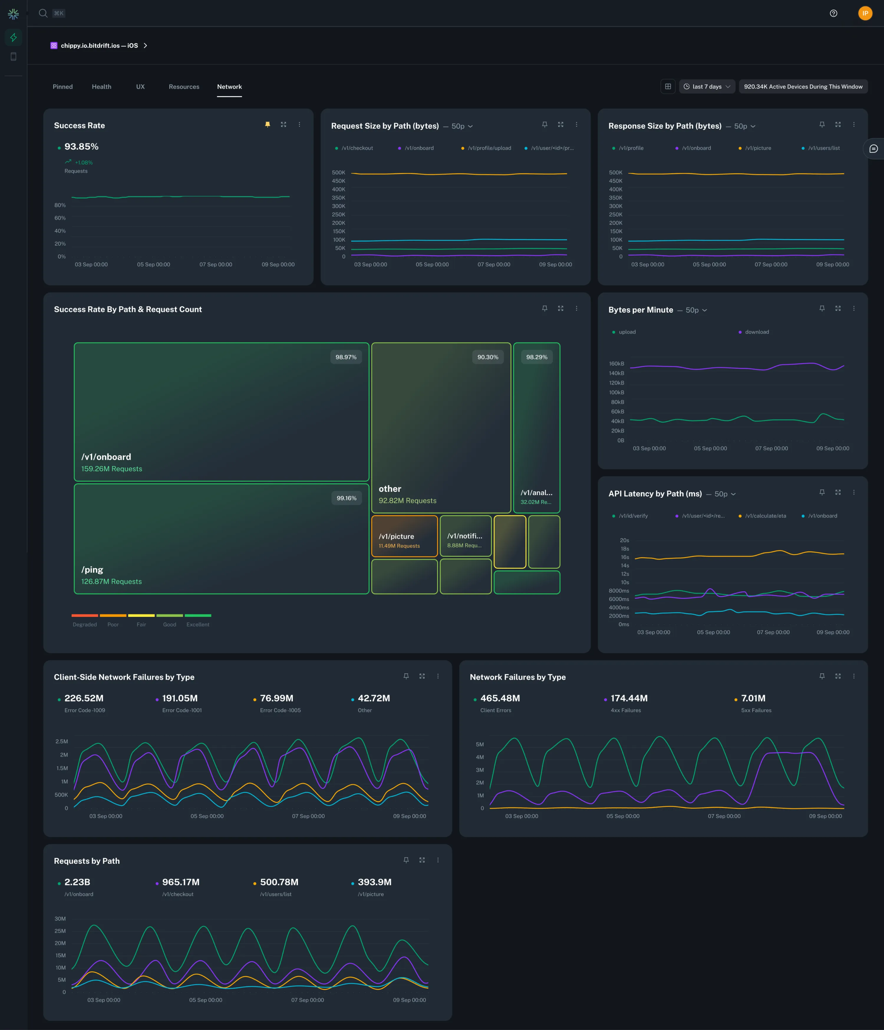
Network
The Network category provides an overview of your app's network usage. It includes charts that show success rate, request size, API latency, and more.
GraphQL Support
If GraphQL is being used for network operations, bitdrift capture SDK facilitates the collection and extraction of GraphQL operation names from the respective API calls. It uses this information to further enrich the networking data like success rate, response times and payload sizes.
Info
See the SDK > Networking Integration section for information on how to instrument all this data automatically.
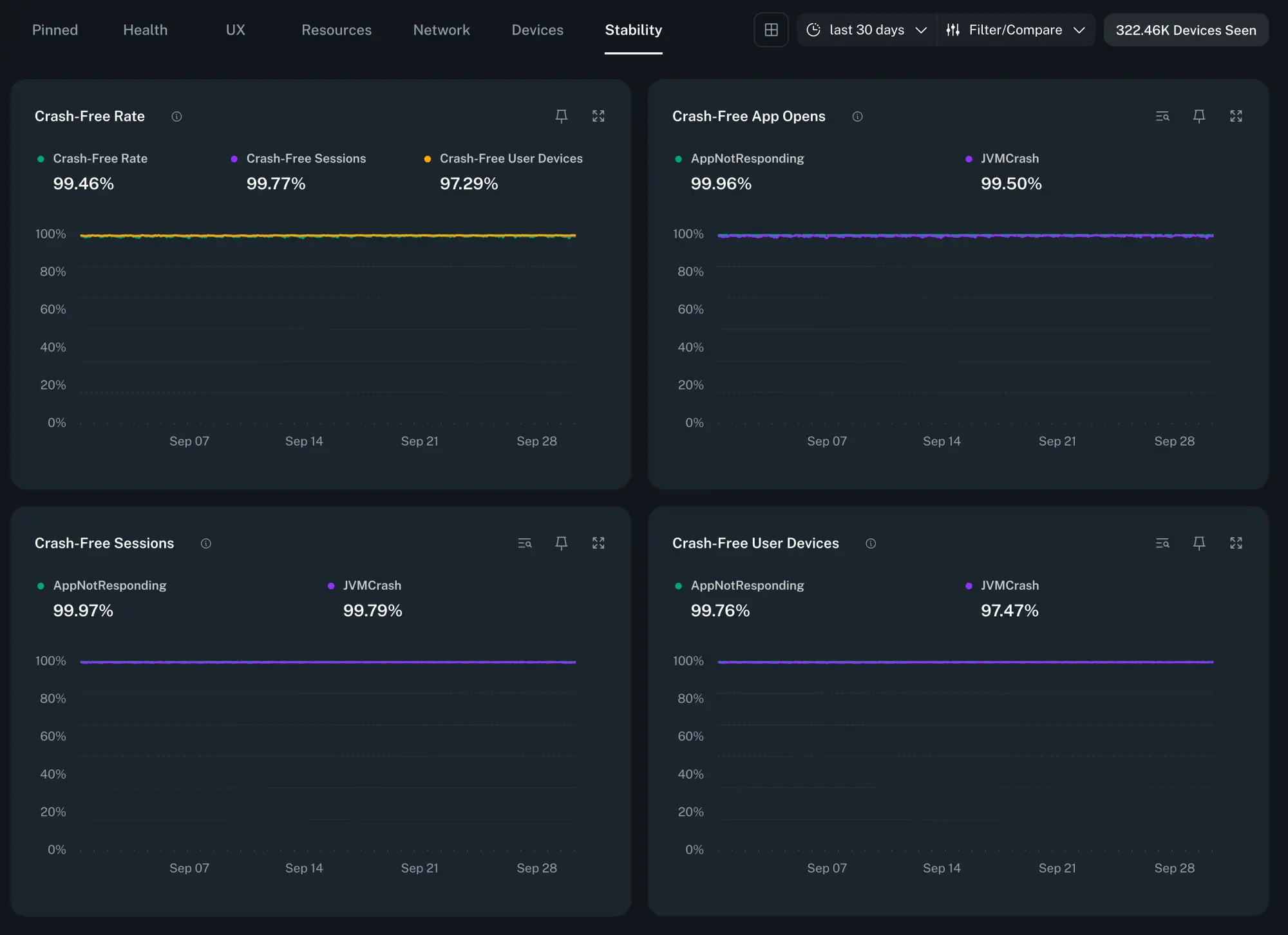
Stability
The Stability category helps you monitor the reliability of your app releases. It shows the stability score as the percentage of users who remained crash-free within a given time period.
The data is categorized by app opens, sessions, user devices, as well as broken down by the type of the crash for each score.
Alerts
You can be notified when crashes are spiking in order to stay on top of your Stability score. See the Issues Alerts and Notifications guide for information on how to configure them.
Info
See the SDK > Issues & Crashes section for information on how to configure crash tracking.
